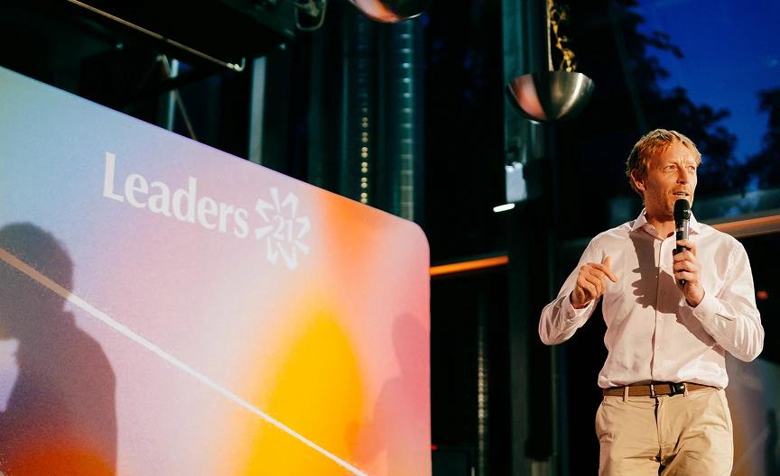
Leaders 21
Logo and visual identity for a participatory community built around bringing together people from different fields and backgrounds, creating space to challenge, share experiences, and collectively develop ideas that makes difference.

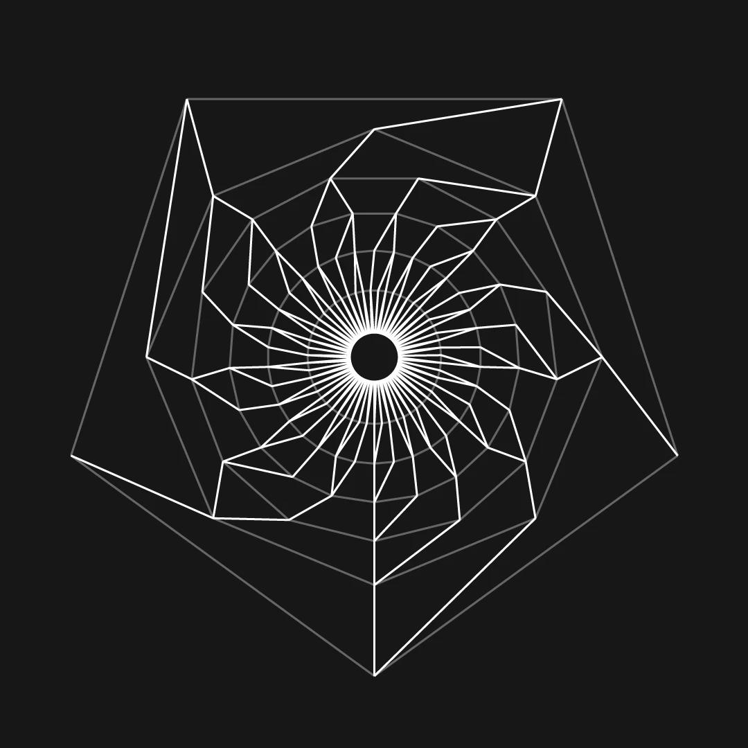
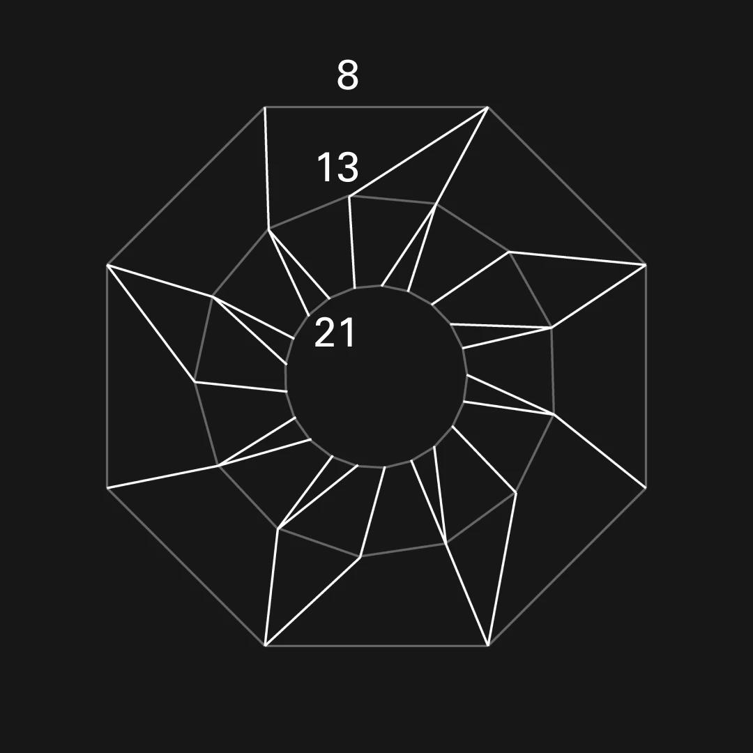
The symbol is inspired by the Fibonacci's rabbit tree. Each node symbolizes a member of the community and follows the same set of rules (shared values). It creates a pattern that is unique with every new iteration with nodes converging on the golden ratio. The final symbol is a drastic, but thoughtful reduction of the rabbit tree. It goes from 8 to 21 in the middle. The variable stroke and not exact positions make the symbol more lively and organic. A network, a community, or an explosion and transfer of ideas.

Visual identity is accompanied by colorful and fluid motifs that represent connections between the community and exchange of ideas. The overlapping form and shifting colors reflect the energy, diversity, and openness of the network.


The headings are typeset in Optima, a typeface that sits between a sans serif and serif. The strokes don’t terminate as a straight line, nor as a full fledged serifs. Instead, they get progressively wider. This is similar to the the curves in the logo and in the colorful motifs and it results in a humanistic, yet modern feel.

The identity deploys 4 core colors, that are intentionally muted. Paired with the vibrant motifs, they create a pleasing visual contrast while providing moments of calm within the identity. The solid color blocks also give the eye space to rest and provide a clear, consistent background that ensures the typography remains highly legible.